- About
- Visiting
- What’s On
- Venue hire
- Catalogues
- Collections
- 101 Treasures of Chetham’s
- Digital Resources
- The Flowers of Histories
- A Book of Hours from France
- The Manchester Scrapbook
- Thomas Barritt of Manchester
- Art Treasures Examiner of 1857
- Manchester Association for Constitutional Order
- The North Western Museum of Science and Industry: Some Reminiscences by Richard Hills
- Criminal Manchester
- The Cup of Destiny
- Athenaeum Souvenir
- Middle English Manuscripts
- Manchester and Liverpool of Today
- Hollingworth’s Mancuniensis
- Memoir of Cecil Wray
- William Seward’s Diary
- The Anti-Monopolist
- Fishwick’s History of Rochdale
- Knyvett’s Defence of this Realm
- Tractatus de Nigromantia
- Axon Ballads
- Printed Books & Ephemera
- Archives & Manuscripts
- Prints and Photographs
- Blog
- Support us
Pamphlet wars: Roger L’Estrange and printed polemic in Restoration England
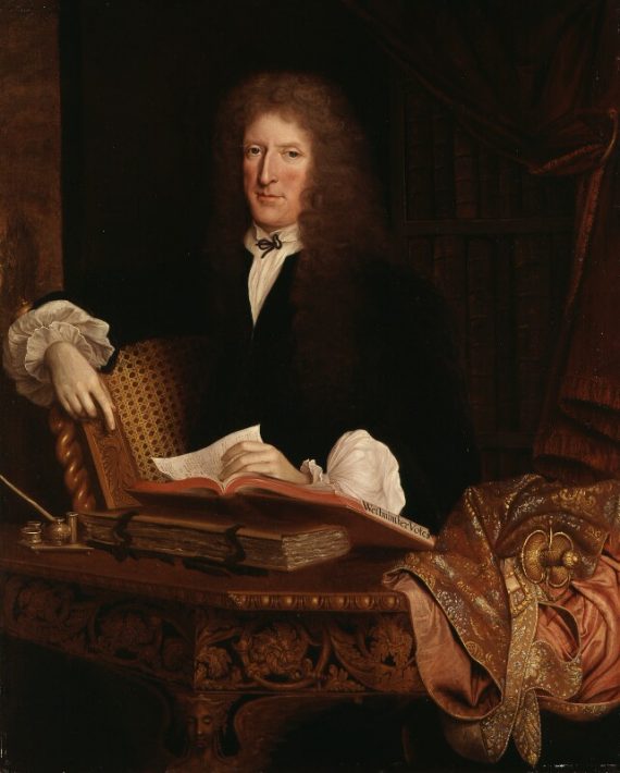
We’re delighted to welcome to the blog Verônica Calsoni Lima, PhD student (University of Sao Paulo & The Sao Paulo Research Foundation) and Visiting Research Fellow at Chetham’s Library and Goldsmiths, University of London.
Verônica is researching censorship and illegal printing in seventeenth-century England, and here explains the historical context for her project and fascinating discoveries about the visual and material aspects of the printed texts.
In 1660, Charles II was restored to the throne. It marked the end of two decades of revolutionary turbulence. But though the monarchy was reestablished, the political and religious controversies were not completely contained. Since the restoration of the monarchy was not well received by all subjects, some still protested against the king and desired the return of a Commonwealth regime. The government put great effort into extinguishing these echoes by reinforcing control and censorship. Opponents were persecuted and imprisoned, traitors were executed, plots were rapidly discovered and suppressed, and antiroyalist propaganda was vigorously seized.
The authorities certainly knew the dangerous potential of the printing press. Fearing the emergence of another turbulent moment such as the period from 1641 to 1660, the recently restored government rapidly tried to restrain the production and commerce of printed texts. Spies were employed to search for seditious activities and older legislation concerning the regulation of the press was reinforced, demanding the licensing of texts prior to their production, forbidding controversial topics and limiting the number of print shops.
One of the most enthusiastic defenders of strict censorship was Sir Roger L’Estrange (1616-1704). He seized seditious literature in printing workshops and bookshops, suggested measures for the improvement of press control and, in 1663, was named by Charles II as Surveyor of the Press. Under L’Estrange’s rule, stationers faced many constraints, having their houses searched frequently and their materials apprehended at the slightest suspicion of sedition. Some of them even complained to the Stationers’ Company and other authorities against the harassment they were constantly suffering because of L’Estrange’s policy.
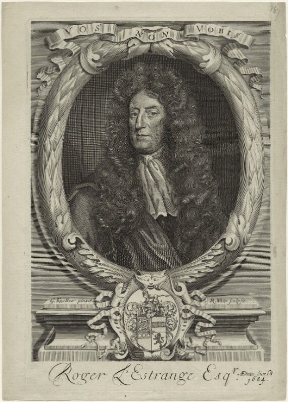
Sir Roger L’Estrange by Robert White, after Sir Godfrey Kneller, Bt
line engraving, 1684. NPG D32809. © National Portrait Gallery, London
At the same time as censoring and suppressing dangerous pamphlets and books, L’Estrange also employed his time and effort in replying to these texts. A prolific pamphleteer, he wrote numerous works denouncing seditious literature and its producers. Together with his friend and publisher, the bookseller Henry Brome (c.1620s-1681) who was settled at the sign of the Gun in Ivy-Lane in London, L’Estrange managed to establish a distinctive mark in his pamphlets, both discursively and materially.
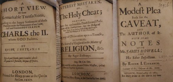
Sample title-pages from L’Estrange and Brome’s publications.
Their frontispieces were intended to be eye-catching. They usually had appealing titles in large bold letters, with subtitles mentioning the targeted opponents.
The pages of L’Estrange’s and Brome’s works were composed to graphically represent a debate, with multiple voices and arguments. As can be seen in the example below, Gothic and Roman fonts were both used. The first was employed to print the words of L’Estrange opponents, against monarchy:
“I do acknowledge and Declare that the Warre undertaken by Both houses of Parliament in their Defence against the forces raised in the Name of the Late King, was Just and Lawfull”.
The second font was used to analyse and criticize the quotation. Gothic was commonly employed in ballads and more popular genres. Hence it was frequently associated with readers of lower social status. Its presence on the page is significant, as a way to depreciate the anti-royalist discourse, and, at the same time, exalt L’Estrange’s position.
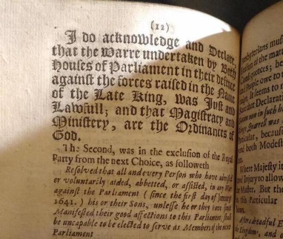
Sample page from Interest Mistaken, or The Holy Cheat (1661).
Debating, both in oral and written traditions, was a common practice among politicians, philosophers, theologians, and all kinds of authors. With the advent of the movable press, debates had to be reshaped to fit the printed page. Opposing points of view had to be represented in paper sheets in a way that the reader could distinguish between them. For that purpose, many texts combined simple Roman and italic types: Roman for the author’s speech and italics for quoting his or her opponent. Quotation marks, spacing and typographical signs could also be used in order to improve the readers’ experience. In this sense, L’Estrange’s and Brome’s publications were not unique in a universe of printed disputes. Notwithstanding, their pamphlets were quite ingenious in the visual organisation of the debates. Their texts were composed with many resources: Roman and Gothic types; upper cases; small caps; bold and italic letters, quotation marks, asterisks, dashes and other symbols; lines, borders and marginal notes. Everything was employed to give the impression of a heated debate.
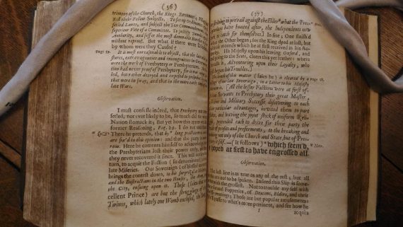
Sample pages from Interest Mistaken, or The Holy Cheat (1661).
Combined with witty and violent arguments from L’Estrange towards his opponents, his pages are like battle scenes.
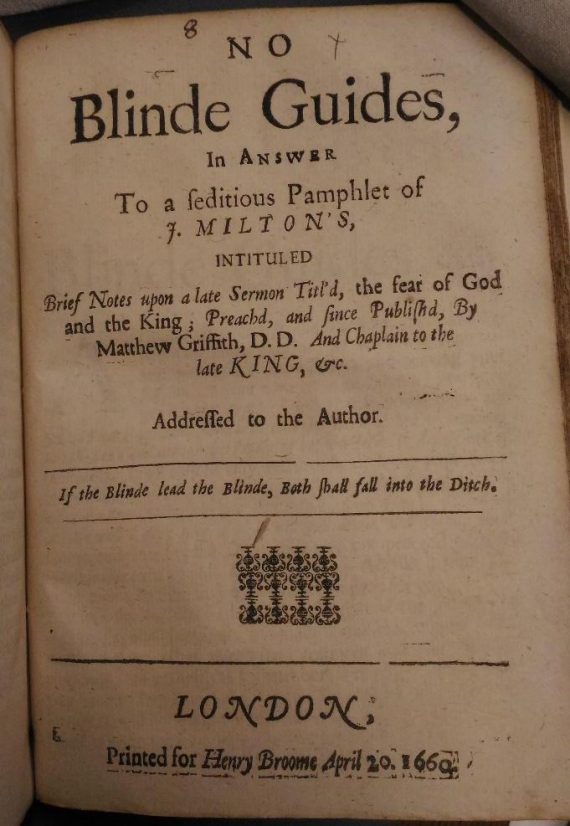
No Blinde Guides title-page (1660).
In No Blinde Guides, L’Estrange replied to a pamphlet by the poet John Milton (1608-1674), Brief notes upon a late sermon, titl’d, The fear of God and the King, in which the author demonstrated his discontentment with the Restoration. According to Milton, the monarchy’s reestablishment was against God’s will. L’Estrange strongly disagreed and wrote a response in which the very title mocked Milton’s visual impairment, discrediting the poet’s guidance on political and religious matters, since he was blind. The offensive title was completed by a short note just before the imprint, quoting Matthew 15:14: If the Blinde lead the Blinde, Both shall fall into the Ditch. This alerted readers that if they believed Milton’s words, they would be as sightless and lost as him.
After this first attack, the next pages were filled with comments on direct quotations both from Brief notes andThe readie & easie vvay to establish a free Commonwealth, published by Milton in March 1660.
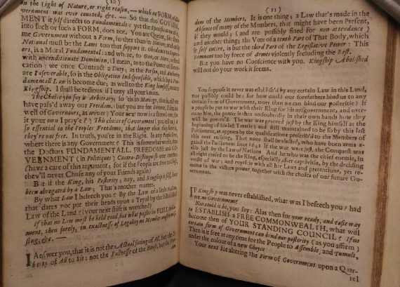
Section of page 11, No Blinde Guides (1660).
L’Estrange counteracted Milton’s beliefs, suggesting instead that a Commonwealth or the absence of a monarchy represented a state of anarchy. The chaotic atmosphere he imagines is emphasized by the visual composition of his sentences, in which italics, upper cases and Roman types are merged:
“If Kingship was never established, what was I beseech you? had we no Government? Nor could it be, you say: Alas then for your ready, and easie way to ESTABLISH a FREE COMMONWEALTH, what will become then of YOUR STANDING COUNCIL? If no certain form of Government can bind our posterity (as you affirm) Then is it free at any time for the People to Assemble, and Tumult, under the colour of a new Choyce.“
Rather than looking for conciliation, this polemical genre sought to show the difference among the points of view and guide the readers’ comprehension of the debate. The game of quoting and criticizing was used to polarize the discussion. Words could be printed in different fonts, weights, emphases, and sizes, in order to persuade the reader. So it is not only the contents of books and pamphlets which are significant. As Joseph Moxon (1627-1691), a typographer, remarked in one of his manuals: “a stationer should consider how to make his Indenting, Pointing, Breaking, Italicking, &c. the better [to] sympathize with the Authors Genius, and also with the capacity of the Reader.” Seventeenth-century audiences were probably aware of the devices employed in the production of their media and knew how to interpret them. As readers of a different time, we – historians, librarians, archivists, researchers, students and the curious more generally – should pay more attention to how the texts were displayed.
* * *
Verônica presented her research in a free lunchtime talk at Chetham’s Library on Weds 3 Apr 2019. If you would like to see the slides from this event, including references for the books used, please click the following link: Pamphletwarsppt
